Deprecated in Current Release
Measure print quality factors: color response, tonal response, and Dmax
|
NOTE: Print Test will be deprecated in Imatest 5.2. |
Imatest Print Test measures several of the key factors that contribute to photographic print quality,
- Color response, the relationship between pixels in the image file and colors in the print,
- Color gamut, the range of saturated colors a print can reproduce, i.e., the limits of color response,
- Tonal response, the relation between pixels and print density, and
- Dmax, the deepest printable black tone: a very important print quality factor,
using a print of a test pattern scanned on a flatbed scanner. No specialized equipment is required. You can observe response irregularities by viewing the test print, but you need to run Print Test to obtain detailed measurements of the print’s color and tonal response.
The essential steps in running Print Test are
- Assign a profile to the test pattern, if needed.
- Print the test pattern, noting (as applicable) the printer, paper, ink, working color space, ICC profile, rendering intent, color engine, and miscellaneous software settings.
- Scan it on a flatbed scanner, preferably one that has been profiled. Best results are obtained by scanning it next to a step chart such as the Koda Q-13.
- Run Imatest Print test.

Color quality is a function of gamut— the range of saturated colors a print can reproduce, as well as overall color response— the relationship between file pixels and print color. Tonal quality is strongly correlated with Dmax— the deepest attainable black tone, as well as the tonal response curve. Prints usually appear weak in the absence of truly deep black tones.
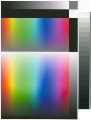
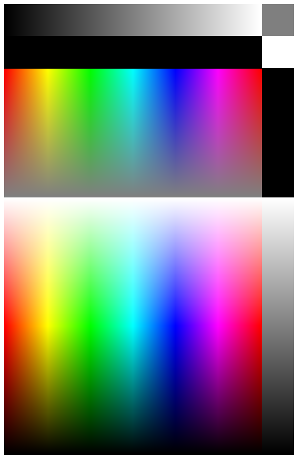
The test pattern, shown (reduced) on the right, was generated using the HSL color representation.
- H = Hue varies from 0 to 1 for the color range R → Y → G → C → B → M → R (horizontally across the image on the right). (0 to 6 is used in the Figures below for clarity.)
- S = Saturation = max(R,G,B)/min(R,G,B). S = 0 for gray; 1 for the most saturated colors for a given Lightness value.
- LHSL = Lightness = (max(R,G,B)+min(R,G,B))/2. (The HSL subscript is used to distinguish it from CIELAB L.) L = 0 is pure black; 1 is pure white. The most visually saturated colors occur where LHSL = 0.5.
The key zones are,
- S=1. A square region consisting of all possible hues (0 ≤ H ≤ 1) and lightnesses (0 ≤ LHSL ≤ 1), where all colors are fully saturated (S = 1), i.e., as saturated as they can be for the Lightness value.
- L=0.5. A rectangular region consisting of all possible hues (0 ≤ H ≤ 1) and saturation levels (0 ≤ S ≤ 1) for middle Lightness (LHSL = 0.5), where colors are most visually saturated.
- Two identical monochrome tone scales, where pixel levels vary linearly, 0 ≤ {R=G=B} ≤ 1.
The zones labelled K, Gry, and W are uniform black (pixel level = 0), gray (pixel level = 127), and white (pixel level = 255), respectively.
Detailed instructions
- The printer test patterns are located in the images subfolder of the Imatest installation folder. They can also be downloaded from the following links: Print_test_target.png (no embedded profile), Print_test_target_sRGB.tif , Print_test_target_Adobe.tif, Print_test_target_WGRGB.tif (embedded profiles as indicated in the file name). These patterns all contain the same data; only the profile tag differs. [I was unable to save embedded profiles in PNG files with any of my editors, so I used LZW-compressed TIFF. (I found a small error when using maximum quality JPEGs.)]
| Assigning a profile: To explore the effect of working color space on print quality you may want to change the ICC profile of the test image without changing the image data. |
| In Photoshop: Click Image, Mode, Assign Profile… |
| In Picture Window Pro: Click Transformation, Color, Change Color Profile… Set Change: (the bottom setting) to Profile Setting Only. |
-
Open a test pattern in an image editor, preferably an ICC-aware image editor such as Photoshop or Picture Window Pro with color management enabled. For most printer testing I recommend Print_test_target_Adobe.tif, which has an embedded Adobe RGB (1998) profile, but patterns with other color spaces are also of interest. Print test lets you see the effect of printing with different color spaces.
- Print the pattern, approximately 6.5x10 inches (16x25 cm), from your image editor. Carefully record the paper, ink, working color space, ICC profile, rendering intent, and printer software settings. I recommend running a nozzle check before making the print— just make sure everything is OK.
- Scan the print on a flatbed scanner at around 100 to 150 dpi. The scanned image should be no larger than about 1500 pixels high. Higher resolution is wasted; it merely slows the calculations. The pattern must be aligned precisely (not tilted). The scanner’s auto exposure should be turned off and ICC Color Management should be used if possible.On the Epson 3200 flatbed scanner, I click on the Color tab in the Configuration dialog box, then select ICM. Source (Scanner): is either be EPSON Standard or a custom scanner profile. Target: should be one of the three profiles recognized by Print test: sRGB (small gamut; comparable to CRTs), Adobe RGB (1998) (medium gamut; comparable to high quality printers), or Wide Gamut RGB (larger gamut than any physical device). Since the Epson standard profile, which represents the scanner’s intrinsic response, has a large gamut (between Adobe and Wide Gamut RGB, according to ICC Profile Inspector), and since the measured printer gamut is bounded the gamut of the working color space, a moderate to large gamut color space should be chosen for best accuracy. I recommend Adobe RGB. The profile is not embedded in the output file; you’ll need to remember it: it can be part of the file name.
- Save the scan with a descriptive name. TIFF, PNG, or maximum quality JPEG are the preferred formats. A reduced scan of a print made on the Epson 2200 printer with Epson Enhanced Matte paper and the standard Epson ICC profile is shown above. Colors are somewhat more subdued than glossy, semigloss, or luster papers.
- Accuracy is improved if you scan a Q-13 or equivalent reflective step chart next to the print (shown on the right of the above image), then run Stepchart. When the run is complete, check the box labelled “Save Print test calibration data” in the Save Q-13 Stepchart Results window. This saves the tonal response and Dmax calibration data, even if you click to Save Q-13 Stepchart results? This only needs to be done once for a set of scans made under identical conditions. This optional step improves the accuracy of the tonal response and Dmax.
| Scanner settings and performance verification | ||||
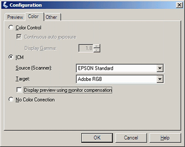 For the Epson 3200 flatbed scanner, the Configuration dialog box, shown on the right, is opened by clicking Configuration… in the main window. If you have a trustworthy custom profile for your scanner, you should enter it in the Source (Scanner): box. The Epson Standard (default) profile is shown.If the custom profile is not visible, go to Control Panel, double-click on Scanners and Cameras, right-click on your flatbed scanner, click Properties, then click on the Color management tab. Click then select the custom profile. (A lotta steps!)Target: contains the output profile for the scan. Adobe RGB is recommended in most cases because its gamut exceeds that of most high quality printers: sRGB (the default) may not be sufficient. Make sure to select the same Color space for the scanner in the Print test input dialog box. Note: this profile is not embedded in the scanner output. This is a deficiency in the Epson scanner software: almost a bug (though a common bug; it appears in many cameras and raw converters.). You need to remember the profile and embed it in the file without changing the image data. See Assigning a profile, above. For the Epson 3200 flatbed scanner, the Configuration dialog box, shown on the right, is opened by clicking Configuration… in the main window. If you have a trustworthy custom profile for your scanner, you should enter it in the Source (Scanner): box. The Epson Standard (default) profile is shown.If the custom profile is not visible, go to Control Panel, double-click on Scanners and Cameras, right-click on your flatbed scanner, click Properties, then click on the Color management tab. Click then select the custom profile. (A lotta steps!)Target: contains the output profile for the scan. Adobe RGB is recommended in most cases because its gamut exceeds that of most high quality printers: sRGB (the default) may not be sufficient. Make sure to select the same Color space for the scanner in the Print test input dialog box. Note: this profile is not embedded in the scanner output. This is a deficiency in the Epson scanner software: almost a bug (though a common bug; it appears in many cameras and raw converters.). You need to remember the profile and embed it in the file without changing the image data. See Assigning a profile, above. |
||||
Scanner color response: Because Print test results are filtered by the scanner’s color response, it’s a good idea to verify it using Colorcheck. The response of the Epson 3200 with Epson’s default ICC profile, shown below, is very good; comparable to the best digital cameras. For the best accuracy you should profile your scanner using one of several available software packages. |
 |
Scanner profiling on a budget from Photographical.net has a nice introduction to the process. Part 2 describes a promising free program called IPhotoMinusICC. (I has lots of poorly-documented options. I tried it and didn’t get good results. I didn’t take the time to figure out where I went wrong.) There are also several commercial programs of interest: Profile Mechanic – Scanner from the creators of my favorite image editor, Picture Window Pro. Works with IT8, GretagMacbeth ColorChecker, and other charts. |
- Run Imatest. Select the module. Crop the image so a small white border appears around the test pattern. If you scanned a Q-13 chart beside the test chart, be sure to omit it from the crop. After you’ve cropped the image, the Print test input dialog box, shown below, opens. opens a browser window containing a web page describing the module. The browser window sometimes opens behind other windows; you may need to check if it doesn’t pop right up.
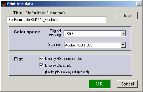
Two color spaces, both of which default to sRGB, need to be entered manually because Print test does not recognize embedded ICC profiles. (And many scanners don’t bother to embed them in their output.)
- Specify the (original) working color space used to print the target. This space is used in the La*b* plots below to generate curves representing the color space for various L (lightness) and S (saturation) levels. These lines are used to compare the actual and ideal color responses.
- Specify the color space used for the scanner output. In the Epson 3200, it is specified Configuration… dialog box, described above.
The two checkboxes in the Plot box select figures to display. (La*b* plots are always displayed.) The HSL contour plots, illustrated below, are derived from RGB values whose meaning is dependent on the color space. They are highly detailed, but lack the absolute color information contained in the La*b* plots. The CIE xy plot is a CIE 1931 chromaticity plot of the gamut (for L = 0.5, S = 0 to 1 in steps of 0.2, and 0 = H = 1). It is familiar, but less readable and less perceptually uniform than the La*b* plot.
Print Test results are filtered by the color space of the scanned file. The Windows default is sRGB, which has a limited gamut. For best results you should scan to a color space with a larger gamut— comparable to your printer. I recommend Adobe RGB (1998). At present I don’t recommend Wide Gamut RGB, which hs a gamut far larger than any printer you’re likely to encounter.
Results
Results below are for Epson 2200 printer with Ultrachrome inks, Premium Luster paper, and the standard 1440 dpi Epson profile. The sRGB test file was used to make the print.
Density
The first Figure contains the grayscale density response and the maximum density of the print, Dmax, where density is defined as –log10(fraction of reflected light). The value of Dmax (2.24) is the average of the upper and right black areas. This value is excellent for a luster (semigloss) paper. Matte surfaces tend to have lower values, typically around 1.8.
The upper plot shows print density as a function of log10(original pixel level (in the test pattern)/255). This corresponds to a standard density-log exposure characteristic curve for photographic papers. The blue plot is for the upper grayscale; the black plot is for the lower-right grayscale. Somewhat uneven illumination is evident. The print density values are calculated from Q-13 calibration curve (lower right). The thin dashed curves contain –log10(pixel levels).
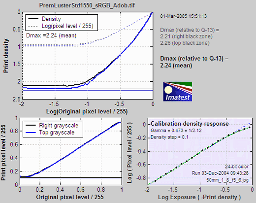
The lower left curve is the characteristic curve (print vs. original normalized pixel level) on a linear scale.
The lower right curve is the results of the (separate) Q-13 calibration run used to calibrate Dmax and the density plot.
S=1 La*b* Gamut map
CIELAB is a relatively perceptually uniform device-independent color space, i.e., that the visible difference between colors is approximately proportional to the distance between them. It isn’t perfect, but it’s far better than HSL (where Y, C, and M occupy narrow bands) or or the familiar CIE 1931 xyY color space, where gamuts are represented as triangles or hexagons inside the familiar horseshoe curve and greens get far more weight than they should.
In CIELAB, colors can be represented on the a*b* plane. a* represents colors ranging from cyan-green to magenta, and b* represents colors from blue to yellow. a* = b* = 0 is neutral (zero chroma). L is a nonlinear function of luminance (where luminance ˜ 0.30*Red + 0.59*Green + 0.11*Blue). The colors of the a*b* plane are represented roughly in the background of the Figure below.
The S = 1 CIE La*b* gamut map below displays cross sections of the La*b* volume representing the printer’s response to test file HSL lightnesses (LHSL) of {0.1, 0.3, 0.5, 0.7, and 0.9} where S = 1 (maximum saturation). These values correspond to near black, dark gray, middle gray, light gray, and near white. Printer gamuts are represented as thick, solid curves. The corresponding values for the original color space— the color space used to print the pattern— are displayed as dashed curves.
Note: The L-values below refer to LHSL in the test file, not CIELAB L.
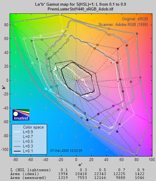
Although this display contains less information than the HSL map (below), the results are clearer and more useful. CIELAB gamut varies with lightness: it is largest for middle tones (LHSL = 0.5) and drops to zero for pure white and black. This is closer to the workings of the human eye than HSL representation.
The petal-like dotted concentric curves are the twelve loci of constant hue, representing the six primary hues (R, Y, G, C, B, M) and the six hues halfway between them.. They follow different curves above and below L = 0.5. The circles on the solid curves show the measured hues at locations corresponding to the twelve hue loci. Ideally they should be on the loci. The curves for L = 0.5 (middle gray) are outlined in dark gray to distinguish them from the background.
The hexagonal shape of the gamuts makes it easy to judge performance for each primary. The measured (solid) shape should be compared to the ideal (dotted) shape for each level. Weakness in magenta, blue, and green is very apparent, especially at L = 0.5 and L = 0.7. But the gamut is excellent for L = 0.3.
L=0.5 La*b* Saturation map
L=0.5 Saturation results are also well suited for display on the CIELAB a*b* plane. Gamuts are shown for 0 = S = 1 in steps of 0.2. As in the the S=1 La*b* Saturation map, the dotted lines and shapes are the ideal values (the color space used to print the pattern) and the solid shapes are the measured values. If the scanner color space is different from the original color space (used to print the target), the scanner color space is slown as thin light dotted lines, barely visible in the image below.
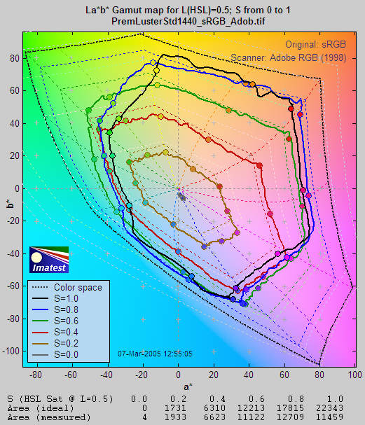
Gamut is excellent for S = 0.2 (brown curve) and 0.4 (red curve). But compression becomes apparent just beyond S = 0.4 for magenta and blue and at S = 0.6 (green curve) for green and cyan, where the printer starts to saturate. Increasing S above these values doesn’t increase the print saturation: in fact, saturation decreases slightly at S = 1. This is the result of limitations of the Epson 2200’s pigment-based inks and the workings of the standard Epson ICC profile. The good performance for relatively unsaturated colors (S = 0.4) is extremely important: skin tones and other subtle tones should reproduce very well on the Epson 2200.
With Gamut maps, differences between printers, papers, and profiles are immediately apparent. These differences are far more difficult to visualize without Imatest Print test because each image has its own color gamut. One image may look beautiful but another may be distorted by the printer’s limitations.
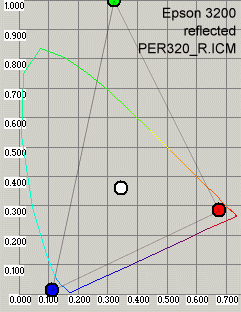
L=0.5 xy Saturation map
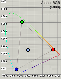
L=0.5 Saturation results can also be displayed in the familiar CIE 1931 xy chromaticity chart. As with the La*b* plot above, Gamuts are shown for 0 = S = 1 in steps of 0.2. As in the the S=1 La*b* Saturation map, the dotted lines and shapes are the ideal values (the color space used to print the pattern) and the solid shapes are the measured values.
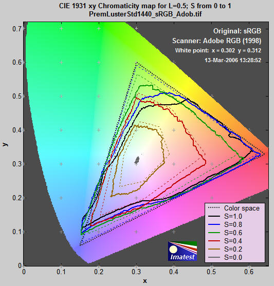
Gamut is excellent for S = 0.2 (brown curve) and 0.4 (red curve). But compression becomes apparent just beyond S = 0.4 for magenta and blue and at S = 0.6 (green curve) for green and cyan, where the printer starts to saturate. Increasing S above these values doesn’t increase the print saturation: in fact, saturation decreases slightly at S = 1. This is the result of limitations of the Epson 2200’s pigment-based inks and the workings of the standard Epson ICC profile. The good performance for relatively unsaturated colors (S = 0.4) is extremely important: skin tones and other subtle tones should reproduce very well on the Epson 2200.
HSL contour plots
The HSL contour plots that follow display color response in great detail, but don’t contain absolute color information. For that you need the La*b* or CIE 1931 xy plots described above. They work best when the same color space is used to print and scan the target. For these plots to be displayed, Display HSL coutour plots must be checked in the Print test input dialog box.
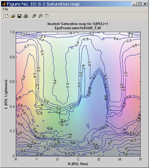
S=1 HSL Saturation plot
The S=1 Figures are for region 1, which contains all possible hues (0 = H = 1) and lightnesses (0 = LHSL = 1) for maximum HSL saturation (S = 1).
The HSL Saturation plot shows the saturation levels. If the print and scanner response were perfect, S would equal 1 everywhere. Weak saturation is evident in light greens and magentas (L > 0.5). Strong saturation in darker regions, roughly 0.2 = L = 0.4, could indicate that it might be possible to create a profile with better performance in the light green and magenta regions. Weak saturation in very light (L>0.95) and dark areas (L<0.1) is not very visible.
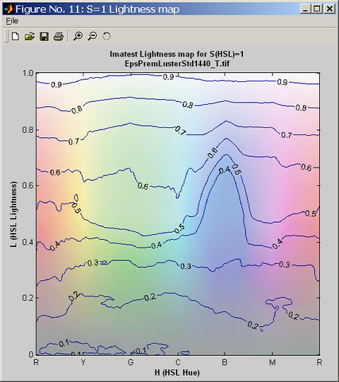
S=1 HSL Lightness plot
The ideal lightness plot would display uniformly spaced horizontal lines from 0.9 near the top to 0.1 near the bottom. (It generally doesn’t go much below 0.1 because of the effects of Dmax and gamma.This plot shows relatively uniform response except for blues with L between 0.3 and 0.6, which appear darker than they should.
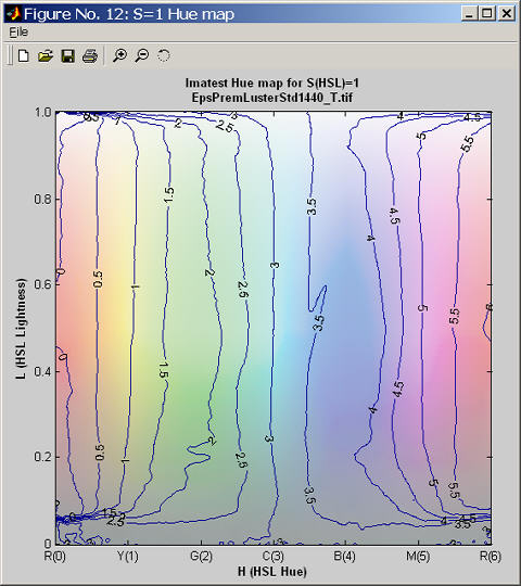
S=1 HSL Hue plot
Colors are labelled 0 to 6, corresponding to hues from 0 to 1. This clarifies the plot by making each primary color an integer: Red = 0 and 6, Yellow = 1, Green = 2, Cyan = 3, Blue = 4, and Magenta = 5. This way, contour increments are 0.5 instead of 0.08667. The ideal Hue map would consist of uniformly spaced vertical lines aligned with the x-axis. The hues here are rather good, but blues are a bit bloated and the magentas are somewhat squeezed. This is also visible on the S=1 Gamut map. There is a highly visible irregularity at L=0.6 on the blue-magenta border (also noticeable on the saturation plot). Hue errors in very light (L>0.95) and dark areas (L<0.1) are not very visible.
Similar plots are produced for the L=0.5 region, immediately above the S=1 region.
L=0.5 HSL Saturation map
The L=0.5 Saturation map, which displays response to different levels of color saturation, is of interest for comparing different rendering intents (rules that control how colors are mapped when they are transformed between color spaces or color spaces and devices). Colorimetric rendering intents should leave saturation unchanged, at least at low S levels. Perceptual rendering intent expands color gamut when moving to a color space or device with increased gamut; it compresses it when moving to a smaller gamut. But there is no standard for perceptual rendering intent: every manufacturer does it in their own say. “Perceptual rendering intent” is a vague concept; it’s hard to know its precise meaning unless you measure it.
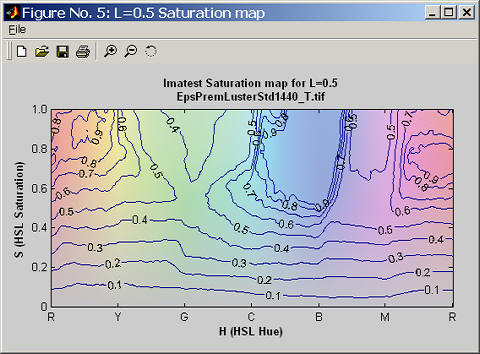
The ideal L=0.5 Saturation map would consist of uniformly spaced horizontal lines from 0.9 to 0.1. The weak saturation in the greens and magentas is visible here. From the viewpoint of overall image quality, behavior at low saturation levels is most visible. The Epson 2200 behaves very well in this region.
An additional Figure with L=0.5 HSLHue and Lightness maps has been omitted.
Digitization and Metric Conversion for Image Quality Test Targets by
William Kress discusses the use and accuracy of flatbed scanners for measuring print quality.