Image Statistics is an interactive utility that lets you examine a number of image properties, including
- Vertical and horizontal cross-sections with adjustable thickness. Using a larger thickness mitigates the effects of noise. Pixel levels or 1D Fourier spectra can be plotted.
- Properties of rectangular or square (eyedropper) regions, including rectangle position, Mean values of R,G,B, and Y (luminance) channels, Log10(mean/max), Noise (sigma), Noise corrected for nonuniformity, SNR (Signal/Noise), SNR dB, and Mean L*a*b* (when color space has been entered).
- Histograms (primarily Luminance channel: R, G, and B channels can be included) for rectangular regions with area greater than 250 pixels.
- Fourier spectrum with linear or logarithmic axes for cross-sections (1D) or rectangular regions larger than 80×80 pixels (2D).
- 3D Surface plot, containing spatial pixel level information (Imatest 5.2+)
- All points below and/or above specified values as blue and/or red, respectively.
- Distance between points in the original image.
- EXIF data— metadata stored in the image file
Running Image Statistics – Cross-sections – Rectangle/Eyedropper – Standard statistics
Histograms – Fourier spectra – 3D surface plots – Other controls
Image Statistics works with any image— not just test charts. It has a number of useful applications, for example,
- For Color/Tone Setup, Color/Tone Auto, and Stepchart you can determine the black level (pixel) offset (a fixed number added to the pixel level) and saturation level for an image.
- Noise may be added to the image after a black level offset has been applied. For this reason the minimum pixel level may not correspond to the offset. The peak of the histogram is a better indicator.
- The saturation level is usually the maximum for the bit depth: 255 for 8-bits (24-bit color) and 65535 for 16-bits (48-bit color), but not always. We have seen 8-bit images that saturate (no longer increase in pixel level as patch brightness increases) around levels 220-235.
You may zoom or lighten the image to view details you might otherwise miss. Zooming makes it easier to select small or tight rectangular regions. It also limits the extent of cross-section displays (so that only regions of interest are displayed). Lightening the image does not affect the numeric results. Images with bit depths of 8 and 16 are supported.
Running Image Statistics
Image Statistics can be opened from
- the Image Stats button in the Utilities tab on the right of the Imatest main window or the Utilities dropdown menu,
- Rescharts, Color/Tone Setup, or Uniformity Interactive, either from the File dropdown menu or from a button in the control area on the right that appears when it’s not used for other purposes,
- Image Processing, from the Analysis dropdown menu. If both input and output images are present, the two images can be rapidly switched for comparison.
Opening Image Statistics brings up the following window. Brief instructions are shown below the image.
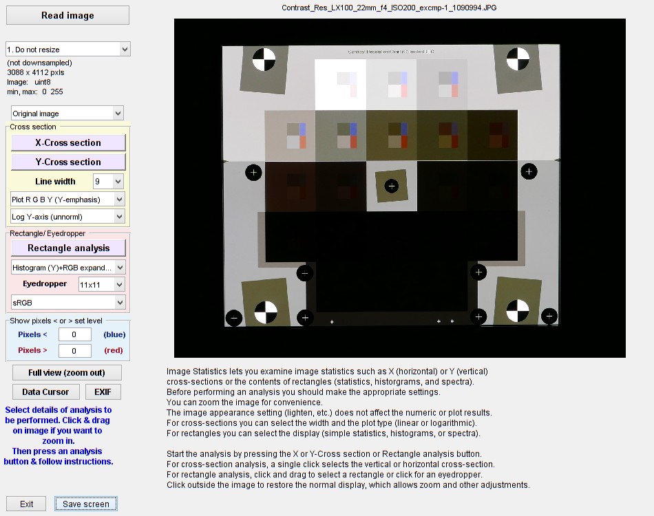 Image Statistics opening window
The window shows the uncropped image in its original brightness (unless it was changed in a previous run). The file name is at the top and a control area is on the left. There are several things you can do prior to performing one of the image analyses.
Image appearance selections. They do not affect numeric results |
 |
Here is an image shown zoomed in and lightened where pixels with a level is under 4 (of 255) are shown in blue and over 252 are shown in red. The zoom remains unchanged while Cross section, Rectangle/Eyedropper and other operations are performed. Click Full view (zoom out) to view the entire image.
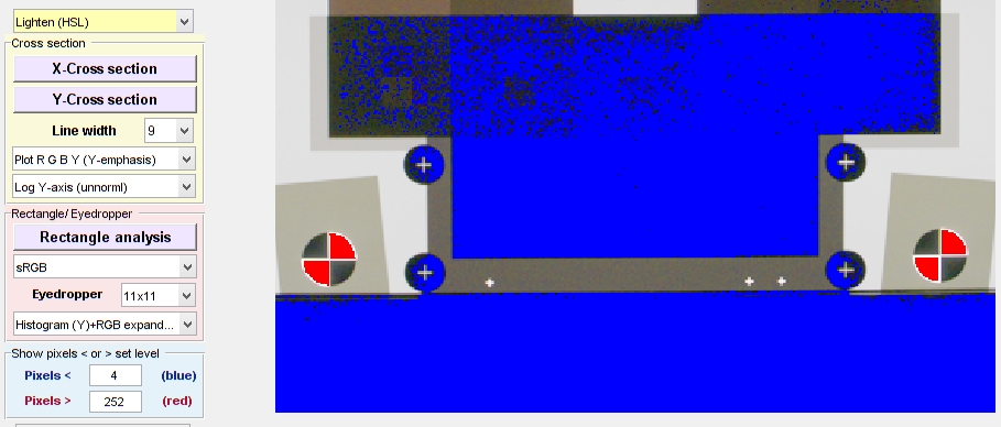 Image Statistics zoomed in, lightened, pixels under 4 (of 255) shown in blue
Cross sections
Pressing X-Cross section or Y-Cross section in the Cross section panel turns on cross-hairs for selecting a horizontal or vertical cross section. You simply need to click on a point in the image to select the desired cross section, which will be contained inside a pair of red lines (vertical, left of center, in the image below). Dragging the mouse has no effect in Cross section mode. Click on a point outside the image (but not on an active button or text) or press esc to turn off the cross-hairs and return to normal mode. Note that most buttons are disabled or made invisible when Cross section mode is active. You need to make settings prior to pressing X or Y-Cross section. (Or course you can always change settings.)
Zooming in on the image (effectively cropping it) is recommended before pressing one of the Cross-section buttons.
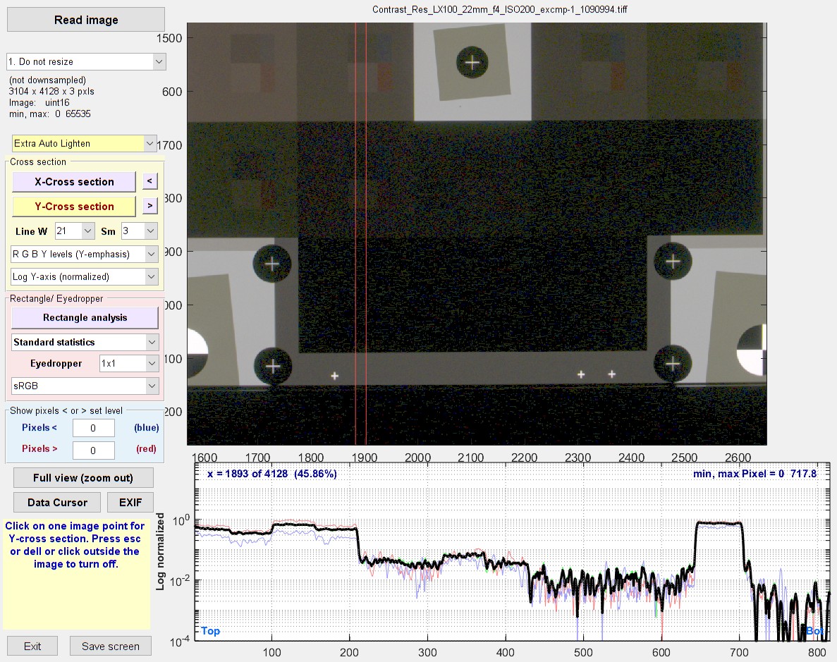
Image Statistics Y-Cross section plot for R G B Y levels with Y-emphasis, zoomed in.
This file had bit depth = 16, which displays more shadow detail than files with bit depth = 8.
Examining the vertical cross-section (with a logarithmic y-axis) enabled us to understand the behavior of this chart/camera combination in very dark areas, where it’s difficult to accomplish visually (we observed short-distance flare light that affected the results). The relatively wide line helped reduce the high noise in the deep shadow region.
Cross section settings Several options are available for Cross section selection and plots.
|
Cross-section plots (1) Plot R G B Y (equal emphasis) (2) Plot R G B Y (Y-emphasis) (default; recommended cross-section) (3) Plot Y (luminance)-only. (4) |Fourier spectrum(Y)| Linear (1D) (5) |Fourier spectrum(Y)| Log-Log (1D) (6) |Fourier spectrum(Y)| SemilogY (1D) (7) |Fourier spectrum(Y-derivative)| Linear (1D) (8) |Fourier spectrum(Y-derivative)| Log-Log (1D) (9) |Fourier spectrum(Y-derivative)| SemilogY (1D) |
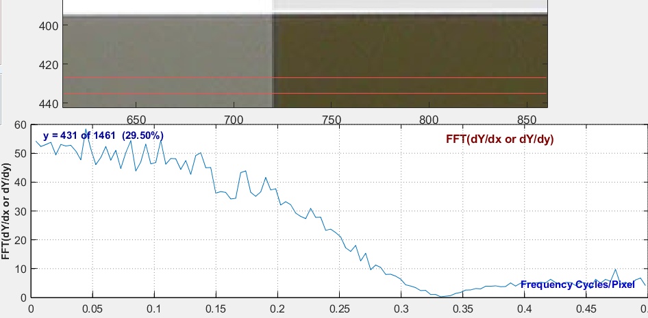 1D FFT of derivative of Y for same chart shown above: Line W = 9; Smoothing Sm = 3
This plot is similar to edge MTF, but is much more sensitive to noise. Sm = 3 causes the null at 0.333 C/P.
Rectangle/Eyedropper analysis
This analysis allows you to examine several properties of rectangular regions (selected by clicking and dragging the mouse) or square eyedropper regions (selected by a simple mouse click—no drag). You can examine basic statistics, which includes means, noise (without and with a nonuniformity correction), CIELAB L*a*b* values, etc. Or you can view a histogram or frequency spectrum of the region. Click outside the image to turn off the Rectangle/Eyedropper selection. The rectangle and results will remain visible until the next selection is made. Here are the settings.
| Selection | Measurement |
| Standard Statistics | Rectangle position, size, and diagonal length RGBY Mean, Noise (corrected and uncorrected), SNR, CIELAB L*a*b* values. Note: RMS noise is the same as standard deviation (σ). |
| Histogram (Y) full x-axis Histogram (Y) expand x-axis Histogram (Y)+RGB full x-axis Histogram (Y)+RGB expand x-axis |
Display a histogram of log10(occurrences+1) for the luminance (Y) channel as a bar plot. Minimum region size = 250 pixels. Means are displayed as diamonds ◊ (for the Y-channel) and asterisks * (R, G, and B). Full x-axes is minimum to maximum for the image (0 to 1, 255, or 65535, depending on the image source and bit depth). Expand x-axis uses the upper and lower limits of the data to determine the x-axis. +RGB adds a stairs plot for the RGB channels to the histogram. Example below. |
| Fourier spectrum Linear (>80×80) Fourier spectrum Log-Log (>80×80) Fourier spectrum Semilogy (>80×80) |
One-dimensional plot the 2D Fourier frequency spectrum of the region with linear x,y axes, logarithmic x’ y-axes, or semilog (linear x, log y). Minimum region size = 80×80 pixels. Of particular interest for patterns like Spilled coins, which is designed to have a 1/f 2D Fourier spectrum. Example below. |
| 3D Surface plot (SLOW) 3D Surface plot (extra smoothing) |
3D plot showing pixel level as a function of x,y location. Can be rotated. Must be turned off then back on to select a new region. Warning: can be very slow for large images. We recommend zooming (cropping) the image first. Extra smoothing is a little faster (but can still be slow). |
| QR code (open if URL) | New in 2021.2. Read a QR or bar code. We recommend zooming (cropping) the image first, especially if it contains more than one QR or bar code. If the code contains a URL, the web page will be opened. |
Additional settings include
- Eyedropper size. Settings are 1, 3, 5, 7, 9, 11, 13, 15, 21, or 25 (lengths of the sides in pixels).
- Color space (dropdown menu) which is used for calculating CIELAB L*a*b* values. Most common color spaces are available: sRGB (the Windows/internet standard) is the default.
Standard statistics
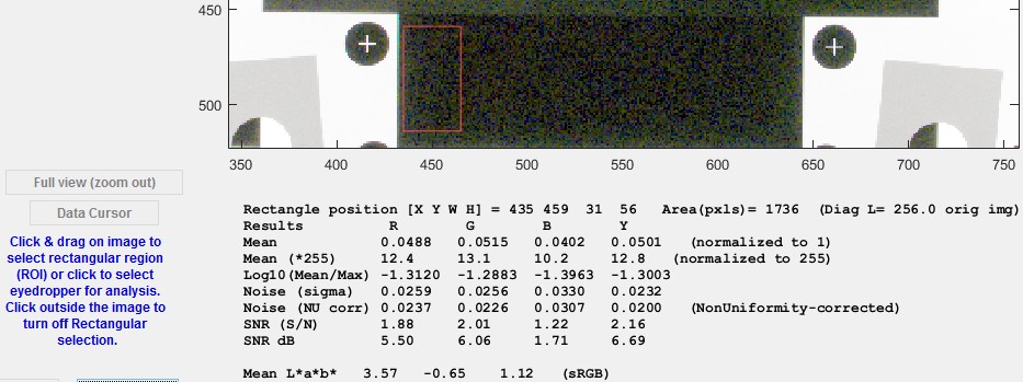 Rectangle/Eyedropper standard statistics: Crop of window showing rectangle
Histograms
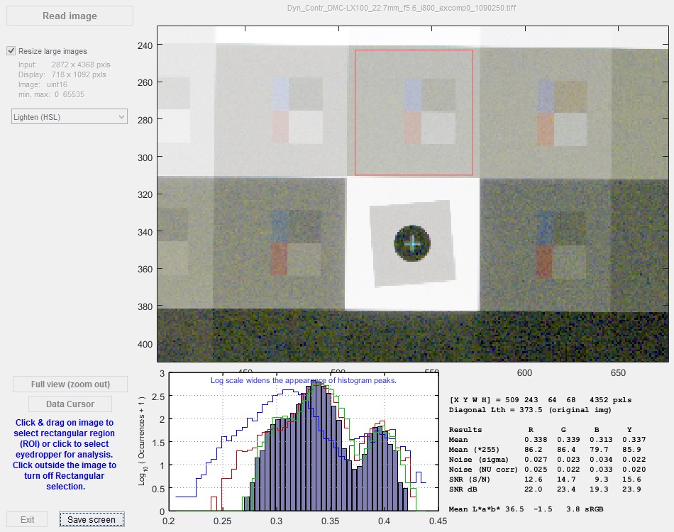 Histogram (Y)+RGB expand x-axis: Y (luminance) channel is a bar plot; RGB channels are stairs plots.
The change in noise when increasing Exposure index is highly visible in this plot.
Fourier transform/spectrum
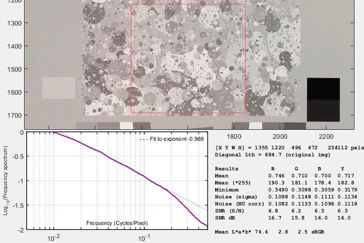 Frequency spectrum with logarithmic axes of a Spilled Coins (Dead Leaves) chart
taken with a high-quality camera phone at 900 lux (bright light; low noise).
A logarithmic first order fit the exponent of the data curve (for the lower third of the data points) is shown as a dotted thin black line. For this pattern the fit is proportional to frequency−0.989. The original chart was designed to have a scale-invariant 1/f (frequency−1) frequency spectrum— very close to the fit. The image was not downsampled, i.e., Resize large images, which would affect results, was unchecked.
This plot lets you quickly observe the frequency spectrum of any image.
- You can look at high quality images of various Dead Leaves and (Imatest) spilled coins charts. We have found that the Imatest Spilled Coins chart is very close to a -1 exponent, which ensures true scale invariance. Other commercially-available Dead Leaves charts have exponents closer to 0.9.
- An “average scene” (a mythological beast if ever there was*) is supposed to have an exponent around -1. This is part of the justification for the design of the Dead Leaves and Spilled Coins charts (along with scale-invariance). You can look at the spectrum for any scene (or portion of a scene) to try to verify this.
*It’s very challenging to find an “average” scene here in Boulder, Colorado, where all scenes (not to mention people) are above average.
(Apologies to Garrison Keillor.) The spectral response of “above average” scenes has never been studied. Might make a good PhD thesis topic.
3D Surface plot (spatial analysis)
The 3D surface plot (Imatest 5.2+) displays spatial pixel information for the selected region. To view this plot, select Surface plot 3D (standard or extra smoothing) in the dropdown menu just below the Rectangle analysis button, press Rectangle analysis, then select a region to display The plot can be rotated by dragging with a mouse. Because the selected region is usually covered by the surface plot, a replica of the selection is displayed to the left. To analyze a different region, click the Restore control buttons & original image button on the left, then press Rectangle analysis again. (This is slightly different from other rectangle analyses, where you can simply select a new region.)
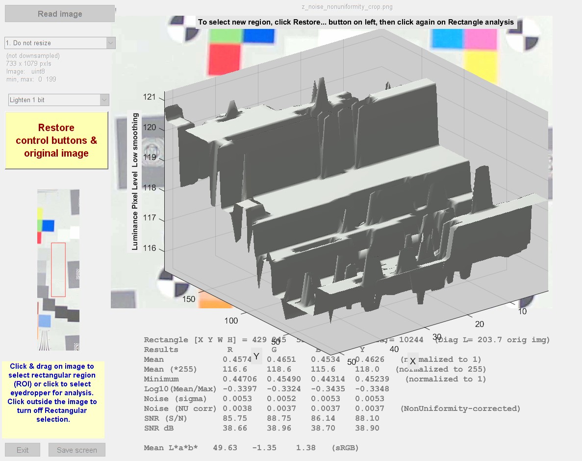 3D Surface plot, showing pixel levels as a function of location
for an 8-bit (256-level) image with low random noise but clear quantization noise
This plot displays spatial information. In this case we can clearly see how the limited number of digital levels (0-255) affects the noise measurement.
Other controls
 Full view (zoom out) restores the original full image view: it zooms out the image (double-click often doesn’t work).
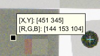
Data cursor lets you see a Data cursor when you click on the image. Example on right. Click on Data cursor (toggle button, which has a yellow background when active) to turn this function on or off. Right-click on the data cursor to remove it.
EXIF displays selected EXIF data (metadata contained in the file) below the image. For full EXIF data, use the File dropdown menu (Phil Harvey’s EXIFtool must be installed and selected).
File dropdown menu lets you paste an image from clipboard, view all EXIF data, Save / display screen, or Close the program.
Image dropdown menu contains several utilities. Most are self explanatory. We suggest that you try it.