Analysis of wedge patterns with the
Imatest Wedge and eSFR ISO modules
|
News 2021.2 — Logarithmic wedges: a superior design describes the advantages of logarithmic wedges, which have a much better distribution of spatial frequencies than hyperbolic wedges, allowing a larger maximum/minimum frequency ratio. Supported by Imatest (automatically detected) since 2021, but (as of May 2022) not currently included in standard eSFR ISO charts (though available on request). 2020.2 — Calculations were greatly sped up in order to improve performance of direct image acquisition. During the testing of the speedup with direct acquisition, we found that Wedge results were unstable during repetitive acquisitions— that noise could cause significant variation from one image to the next. To make results more stable, we made a great many changes to the wedge calculation, most notably increasing smoothing in the bar count and MTF measurements. As a result of these improvements, 2021.1 results are slightly different from earlier versions. The change is not systematic, i.e., there is no bias that would make measured results lower or higher. But the improvement in stability causes results to be different (usually by a small amount) from earlier versions. |
Introduction – Instructions: Wedge module – Settings – Instructions: eSFR ISO
Introduction
Imatest Master can analyze wedge patterns in two modules, both of which can be run from the interactive Rescharts interface or as fixed (batch-capable) modules.
- The Wedge module (described in this document) can analyze any arrangement of horizontal or vertical (but not diagonal) wedges, using manual region selection.
- The eSFR ISO module can analyze pairs of wedges on the Enhanced and Extended eSFR ISO charts, including the charts with extra wedges. Region detection is fully automated. The user need only specify which groups of wedges to analyze.
Both modules measure the onset of aliasing (which is somewhat misnamed: vanishing resolution may be more appropriate) and MTF (Modulation Transfer Function) from converging bar patterns, called “wedges”, which are a part of several well-known resolution test charts. “Hyperbolic” (linear in frequency) wedge patterns are included the ISO 12233:2014 resolution standard. Wedges are included in Imatest eSFR ISO charts (shown below).
|
The “onset of aliasing” (the spatial frequency where the smoothed count of bars drops below 95% of the low frequency count) is much more stable and consistent than summary metrics derived from MTF, such as MTF50 or MTF10 (which is recommended in the ISO 16505 (automotive) standard). Because of noise and aliasing, MTF may never drop to the 10% level, and MTF10 may not be calculated. The onset of aliasing typically takes place around MTF30-MTF10. MTFnn metrics are strongly affected by sharpening; the onset of aliasing is relatively stable. “Vanishing resolution” might be a more appropriate name than “onset of aliasing” because the bar count in poor quality or misfocused lenses drops below the 95% threshold well before aliasing occurs. |
The wedge MTF calculation has significant limitations. Results near the Nyquist frequency are highly sensitive to the phase of the bars relative to the pixels, i.e., the sub-pixel positioning, which is difficult to control. Results are less stable and consistent than slanted-edge measurements, especially in this frequency range. Because wedges have very high contrast, they often saturate, which affects image processing and MTF measurements.
| MTF measured from wedges is generally different from other charts because of possible saturation and different image processing (bilateral filtering, which is affected by feature contrast). The performance of different test charts and modules is compared in MTF Measurement Matrix. |
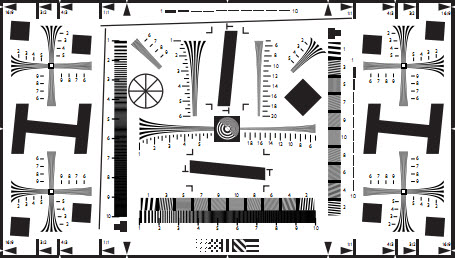
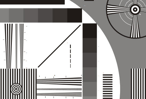
The best-known chart that contains wedge patterns is the ISO 12233:2000 resolution test chart (below, left), which contains 22 hyperbolic wedges: 10 vertical, 10 horizontal, and 2 diagonal. All but the diagonal wedges can be analyzed by the Wedge module. This chart is is no longer recommended in the ISO 12233:2014 standard, and is not our top choice for several reasons.
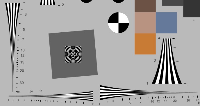
The eSFR ISO Enhanced chart contains at least four pairs of wedges, each consisting of a low (100-500 LW/PH) and high frequency pattern (200-2500 LW/PH) that can be detected and analyzed automatically in eSFR ISO. Analysis results are identical to Wedge module results.
 (Old) ISO 12233:2000 resolution test chart |
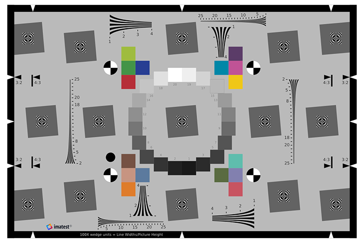 Enhanced ISO 12233:2014 chart (3:2 aspect ratio) Enhanced ISO 12233:2014 chart (3:2 aspect ratio) |
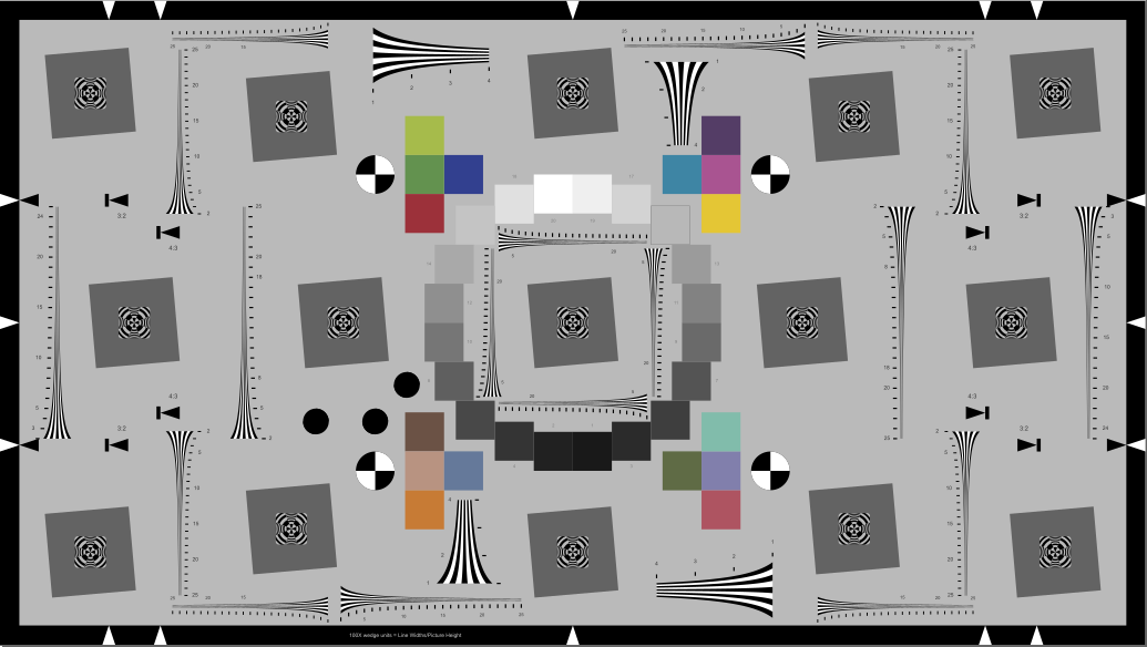 Extended eSFR ISO chart (16:9) with extra wedges Extended eSFR ISO chart (16:9) with extra wedges |
 Enhanced eSFR ISO chart with extra wedges Enhanced eSFR ISO chart with extra wedges |
|
Hyperbolic wedges — Here is a crop of the old ISO 12233:2000 chart that illustrates several of the hyperbolic wedges. Imatest can analyze horizontal and vertical wedges, but not diagonal wedges. ISO 12233 resolution test chart. Hyperbolic wedges are found in a number of other test charts, including the CIPA resolution chart and Imatest Enhanced and Extended eSFR ISO charts. |
 Hyperbolic wedges in ISO 12233:2000 chart |
||||||||
|
Trapezoidal wedges (linear in spacing) are found in fewer charts, most notably the EIA-1956 video resolution test chart, which we do not recommend because its range of spatial frequencies is quite narrow and it has few other usable features. Linear wedged don’t have sufficient real estate for good measurements of (very important) high frequencies. EIA 1956 test chart. Crop of upper-right.
|
 Linear wedges in (obsolete) EIA-1956 chart |
||||||||
|
Logarithmic wedges are available in eSFR ISO charts. They are superior to the other types because they have the same frequency distribution as standard frequency response (or Bode) plots: each octave (or decade) occupies the same distance: low or high frequencies are not severely compressed, as they are with hyperbolic or linear wedges. eSFR ISO automatically distinguishes between hyperbolic and logarithmic wedges. |
|||||||||
We have started work to add them to the ISO 12233 standard. |
 Logarithmic wedges in eSFR ISO (ISO 12233:2017) chart |
||||||||
Testing recommendations
If you are starting an image quality/resolution testing program and need to measure wedges, we strongly recommend the eSFR ISO charts and module, which offer automated region selection, can map resolution (MTF) over the image surface, and measure several image quality factors from a single image.
Wedge measurements with the old ISO 12233:2000 chart requires special care in region selection (described below). To get reliable MTF measurements, at least two regions must be selected (though one is sufficient for onset of aliasing). This chart has too few wedges for a good map of the response over the image surface.
Wedge measurements have a few unique attributes:
- Wedges can be used to measure color moiré fringing that results from aliasing. This cannot be done with slanted-edge measurements, though it can be measured (using a different algorithm that produces slightly different results) with the Log Frequency module.
- The onset of aliasing (the spatial frequency where the number of detected bars drops below the total number of bars in the chart) is relatively independent of signal processing (sharpening, noise reduction, etc.), making it potentially useful for comparing cameras with different signal processing. This frequency is called the “vanishing resolution” in the CIPA standard.
Instructions for the Wedge module
Select the test chart. The ISO 12233:2000 resolution test chart and its variants are by far the best-know charts with wedge patterns, but is no longer an official part of the ISO standard. The wedges in the Imatest Enhanced and Extended eSFR ISO charts (based on ISO 12233:2014) are much more convenient to work with because the wedges can be automatically detected and analyzed with the eSFR ISO module.
Photograph the test chart using reasonably even (±10%) glare-free lighting. A low-cost lighting setup is described in The Imatest Test Lab. Save the image in a standard format (TIFF, BMP, PNG, high quality JPEG, etc.) or in a commercial or binary raw file.
The distance to the chart is not critical. The calibration numbers next to the wedge patterns are ignored by Imatest, which calculates spatial frequencies automatically. The calibration numbers are only valid when the arrowhead patterns at the top and bottom of the chart are aligned with the top and bottom of the image. (They represent spatial frequency in LW/PH when multiplied by 100.) If possible, the highest spatial frequency in the wedge patterns should be above the Nyquist frequency (0.5 cycles/pixel). This may be be difficult to achieve when the original ISO 12233:2000 chart is used with high resolution cameras.
Open Imatest, Press the left, then select either 6. Wedge pattern or 9. eSFR ISO in the Chart type box, below the button on the right. (If either pattern has already been selected, simply click on .)
Open the file to be analyzed.
For eSFR ISO, ROI detection is automatic. You may skip the following paragraphs and go directly to eSFR ISO instructions.
For the Wedge module, select the regions of interest (ROIs) to be analyzed. Read this section carefully: Poor region selection can lead to unreliable results!
In many cases you’ll need to select more than one region for MTF measurements. Only vertical and horizontal (but not diagonal) wedges can be analyzed.
Select the first region using the standard Imatest rough selection window. After you’ve made the selection, the fine adjust window opens.
|
The ends of the wedge should extend beyond the selected region (ROI), usually only by a small amount, i.e., the ends should be outside the ROI. There should be some space inside the ROI on the sides of the wedges. Interfering patterns (like the horizontal lines below) that don’t contact the wedge are tolerated. |
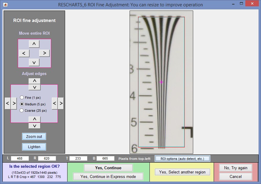 ROI Fine adjustment window
The boundaries of the selected region should be inside the ends of the wedge (top and bottom, above),
and outside the sides, allowing a little “breathing room”.
The selected region may include interfering patterns (mostly horizontal lines in the above image). Wedge employs a very robust algorithm for ignoring them.
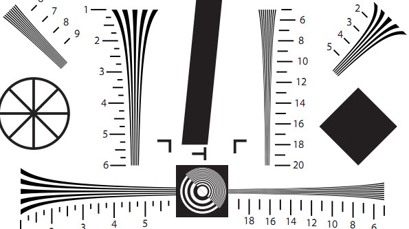
Usually more than one region needs to be selected for MTF measurements because most wedges have a limited frequency range (100-600 LW/PH in the above image, assuming it was framed according to the ISO recommendations— unnecessary for Imatest). To select another region, click (in the yellow region, bottom-center). Referring to the ISO 12233 resolution test chart crop image, above, the first region (5 bars, labeled 1-5, with relatively low spatial frequencies) was located to the left of center. The second region should be the narrower region (9 bars, labelled 6-20, with higher spatial frequencies) to the right of the center.
|
A single region is usually sufficient for measuring the onset of aliasing (the spatial frequency where the smoothed count of bars drops below 95% of the low frequency count), which is much more stable and robust than summary metrics derived from MTF, such as MTF50 or MTF10. If a second region is selected, it should cover a different frequency range |
In some cases two regions will be sufficient for MTF measurements, but in the Applied Image QA-77 test chart, which is a revised version of the ISO 12233:2000 chart with added low contrast edges, the lowest spatial frequency in the hyperbolic wedges is labeled 5, which corresponds to 500 Line Widths/Picture Height when the chart is framed according to specification. This compares to 1 (~100 LW/PH) for the old standard ISO chart. Unfortunately 500 LW/PH is not a low enough spatial frequency to reliably normalize the MTF, which is by definition 1 (100%) at low spatial frequencies. (100 LW/PH is low enough in most practical situations.)
To provide the low frequency reference needed for properly normalized MTF measurements, you can enter a square region (defined by aspect ratio = height/width between 0.7 and 1.4) that contains a single edge, half light and half dark. The edge should reasonably close to the lowest frequency portion of the wedges.
 ROI repeat dialog box (appears when you read an image with the same pixel size as the previous image),
showing three selected regions including a square for low frequency MTF normalization.
When you have selected all the regions, press Yes, Continue or Yes, Continue in Express mode at the bottom of the ROI Fine Adjustment box. If Express mode is not selected, the input dialog box shown on the right appears. This box is also opened when you press .
 Wedge settings box
Settings
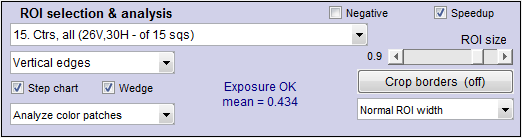
Don’t worry about getting all settings correct if you are running from Rescharts: You can always open this dialog box by clicking on .
Chart type: Either Linear frequency: hyperbolic wedge or Linear spacing: trapezoidal wedge (straight lines). Select the appropriate type.
Gamma is used to linearize the test chart. It can be measured by Stepchart, Colorcheck, or Multicharts. 0.5 is a typical value for color spaces intended for display at gamma = 2 2 (sRGB, Adobe RGB, etc.).
Channel is R, G, B, or Y (luminance; the default).
Display options
Spatial frequency Selects spatial frequency units for display (cycles/pixel, cycles/mm, cycles/in, LW/PH (Line Widths per Picture Height, where 2 Line Widths = 1 cycle or line pair), LP/PH, cycles/milliradian, or cycles/degree). If Cycles/mm, Cycles/in, or Cycles/angle are selected, the pixel spacing (pitch) in pixels per inch, pixels per mm, or microns per pixel should be entered.
Maximum x-axis frequency selects the maximum display frequency.
Secondary readout allows up to two secondary redouts (MTFnn, MTFnnP, or MTF at a specified spatial frequency) to be displayed on the MTF plot. Details here.
After you press , calculations are performed and the most recently-selected display appears.
eSFR ISO instructions
 eSFR ISO automatically detects wedges in the Enhanced or Extended eSFR ISO charts if you check the Wedge checkbox in the eSFR ISO setup window (shown on the right). It also automatically distinguishes hyperbolic from logarithmic wedges.
The original eSFR ISO has four pairs of wedges, each consisting of a low spatial frequency wedge (100-500 LW/PH) and a high frequency wedge (200-2500 LWPH, when framed according to the spec). The lowest frequencies are low enough so that a square low frequency region is not needed for normalizing the MTF measurement. The versions with extra wedges have 12 extra high frequency wedges: 4 near the center and 8 near the 4:3 aspect ratio boundaries. (The Extended version has 2 additional vertical wedges on the extreme left and right sides).
In eSFR ISO interactive (run in Rescharts) you can select any of the outputs available with the Wedge module for any of the sets of wedges (displays 18 and 19).
Results
The Display box in the Rescharts window, shown below, allows you to select one of two displays. Display options are set in boxes below Display. All displays have a channel selection option (Red, Green, Blue, or Luminance (Y) (0.3R + 0.59G + 0.11B).
| Display | Description |
| MTF, Aliasing, and Summary | Display MTF and the onset of aliasing (called “vanishing resolution” in the CIPA DC-003 standard). The onset of aliasing is the spatial frequency where the detected number of bars falls below 95% of the number of bars at low frequencies. A smoothed curve of count vs. frequency is used to reduce errors due to noise. |
| EXIF data & Moire | Displays color Moiré and EXIF data, if available. |
| In addition to the displays, two buttons allow you to save results. | |
| Saves an image of the Starchart window as a PNG file. If you check Display screen in the Save screen dialog box, the image will be opened in the editor/viewer of your choice. (Irfanview works well, and it’s free.) | |
| Saves detailed results in a CSV file that can be opened by Excel and also in an XML file. | |
The spatial frequency is automatically calculated from the image under the assumption that
- frequency increases linearly with distance when Linear frequency (hyperbolic wedge) is selected, or
- spacing (1/frequency) increases linearly with distance when Linear spacing (trapezoidal wedge) is selected.
MTF and Aliasing
The image below shows results for the Canon EOS-40D, 24-70 f/2.8 lens set at 40mm, f/8, JPEG output, Standard picture style. A sequence of images were taken at different focal lengths and apertures. Rename files was used to add the key information (focal length, aperture) to the file name.
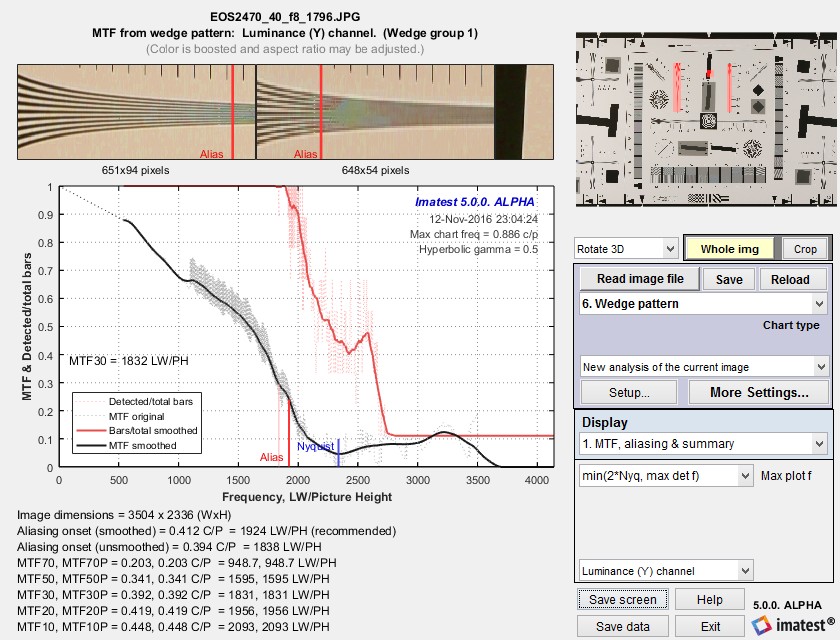 MTF and Aliasing onset results
The jagged sawtooth pattern in the original (unsmoothed) MTF plot (the thin gray dotted lines which look like a gray blur in the above image) arises from differences in MTF between the two wedges, which have overlapping spatial frequencies. The wedges are in different portions of the image, and hence have slightly different MTF. When Wedge is run with a simulated image that has uniform signal processing, the sawtooth pattern does not appear.
Detected/total bars smoothed (thick red line) shows the onset of aliasing. The unsmoothed line is not used because it is susceptible to noise. The smoothed line is calculated from 15 adjacent (equally-weighted) values. The onset of aliasing (“vanishing resolution”) is where the smoothed line drops below 0.95. It is displayed as a vertical red line at the bottom of the plot.
Algorithm: Spatial frequencies are calculated directly from the image using a fit to the frequency variation (linear with distance for hyperbolic wedges). The MTF results for the two wedge images are concatenated, then sorted to obtain the pale gray dashed line. The smoothed results (the black line) is the best MTF calculation; it removes some of the strong numerical artifacts of the original unsmoothed calculation.
Color moiré
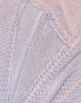
Color moiré on fabric
(Canon Rebel XT with kit lens)
Color moiré is artificial color banding that can appear in images with repetitive patterns of high spatial frequencies, like fabrics or picket fences. The example on the right is a detail of a shirt captured by the Canon Rebel XT with its excellent kit lens.
Color moiré is the result of aliasing in image sensors that employ Bayer color filter arrays, as explained below. Key points:
- Color moiré can appear when there is significant image energy above the sensor Nyquist frequency for the red and green channels (0.25 cycles/pixel; half the image Nyquist frequency of 0.5 cycles/pixel).
- It is affected by lens sharpness, the anti-aliasing (lowpass) filter (which softens the image), and demosaicing software. It tends to be worst with the sharpest lenses.
- It is most noticeable in the red and blue channels.
- Color moiré should be measured near the center of the image, where lenses tend to be sharpest and lateral chromatic aberration (which can mimic color moiré) is minimal.
|
To the best of our knowledge there is no well-established standard for measuring color moiré. The measurement depends on the test pattern, and as a result we’ve had to use a slightly different measurement from the Log Frequency module. One of the parameters shown on the right, selected by the Moire box in the Plot settings area of the Rescharts window, is plotted immediately below MTF in the MTF & Moire displays. The two parameters shown in boldface, R-B and L*a*b* chroma (sqrt(a*2+b*2 )) have proven to be the most useful. A color moiré plot is shown below. The Correct for color density checkbox, which corrects for tonal imbalances in the image, should normally be checked. The lowest frequency where moiré can be visible with Bayer sensors is 0.25 cycles/pixel, half the image Nyquist frequency. This is so because the sensor pixel spacing for the red and blue channels is twice that of the (final demosaiced) image pixel spacing. The total moiré for a selected parameter is the variation of that parameter above 0.3 cycles/pixel, shown in bold red in the plot. For the plot below, it is the maximum – minimum L*a*b* chroma (v(a*2+b*2 )) above 0.3 c/p = 14.9 (L*a*b* units). We recommend checking the Smooth button on the right: the smoothed results are closer to what the eye sees than the very rough unsmoothed results. |
|
||||||||||||||||||||
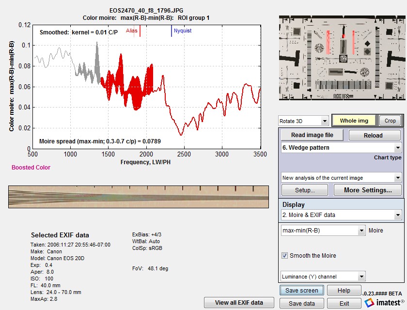
Color moiré and EXIF data, Smoothed results.
MTFnn and Onset of Aliasing stability
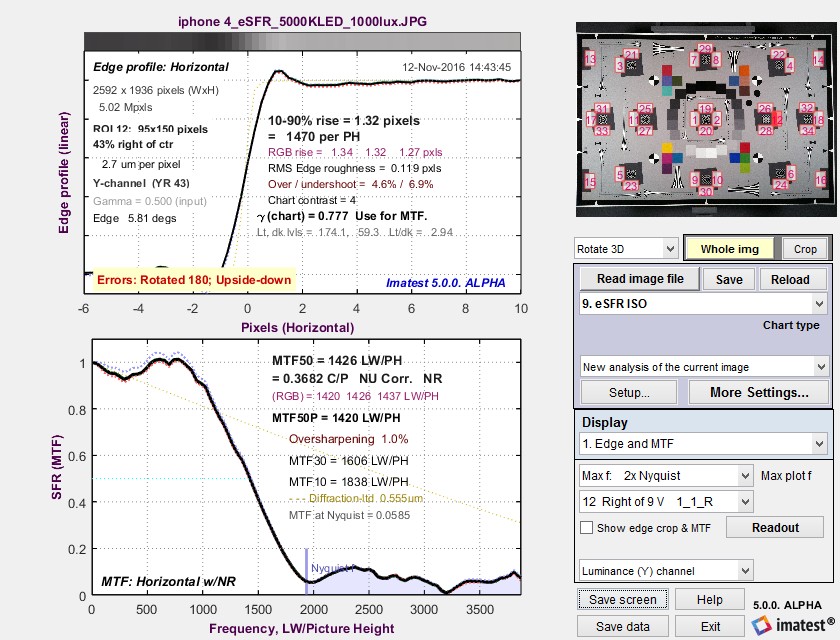
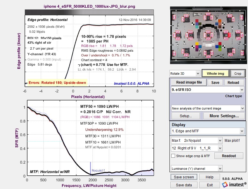
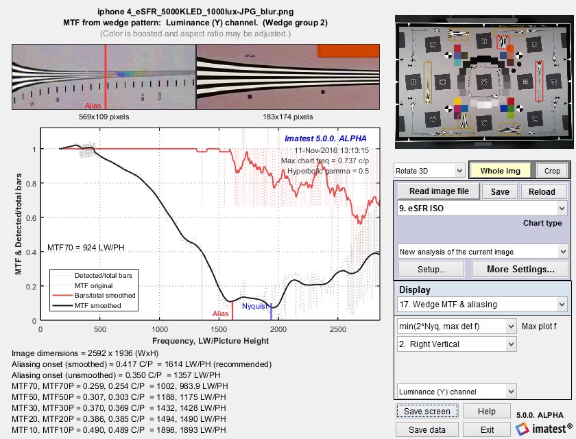
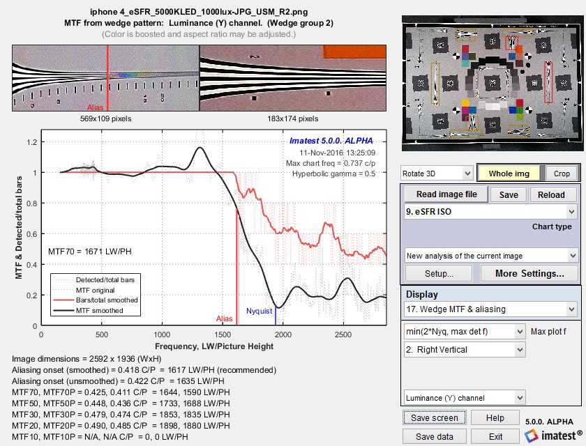
Measurement consistency, including sensitivity of results to sub-pixel positioning and software sharpening, is an important consideration in interpreting Wedge results. To examine this sensitivity we used an image from an iPhone 4 that was fairly sharp to begin with. We created two modified images.
- Blurred using the Imatest Image Processing module with Gaussian blur – 0.6
- Sharpened it using USM (Unsharp Mask) with Radius = 2 and Amount = 1.2. This is very strong sharpening, with a strong spatial domain overshoot and frequency domain peak.
The results are in the table below. Click on any of the images to see them full-sized.
| iPhone 4 | Original image | Blurred (σ 0.6) | USM sharpened (Rad 2 Amt 1.2) |
| Slanted-edge results |
 |
 |
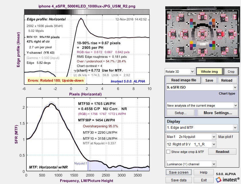 |
| Wedge results |  |
 |
 |
| MTF50 (C/P) Slanted-edge |
0.368, 1426 | 0.282, 1090 | 0.456, 1765 |
| MTF10 (C/P) Slanted-edge |
, 1838 | , 1661 | , 3158 |
| MTF50 (C/P, LW/PH) Wedge |
0.395, 1529 | 0.307, 1188 | 0.448, 1688 |
| MTF10 (C/P, LW/PH) Wedge |
N/A | 0.490, 1898 | N/A |
| Aliasing onset (C/P, LW/PH) |
0.429, 1662 | 0.417, 1614 | 0.422, 1635 |
| iPhone 4 original image | Blurred (σ 0.6) | USM sharpened (Rad 2 Amt 1.2) |
Some observations:
- Aliasing onset is by far the most stable measurement. It closely corresponds with vanishing resolution.
- MTF50 varies, as expected, with the amount of sharpening. The amount of variation is comparable for MTF50 derived from slanted-edges and wedges.
- MTF10, which in an ideal noiseless world corresponds to vanishing resolution or the Rayleigh diffraction limit (the smallest interval or highest spatial frequency where neighboring objects can be distinguished), is a completely unstable and unreliable measurement. For some wedge cases MTF never drops below 10% (0.1), and hence MTF10 cannot be calculated at all. In other cases there is a ramp in MTF response around the 10% level that makes MTF10 very sensitive to small changes in the system. These ramps are visible in several of the plots, above.
- MTF curves are similar but are far from identical at frequencies below about 0.4 cycles/pixel. They diverge strongly at higher frequencies. MTF50 values are reasonably well correlated. MTF derived from the high contrast wedges is affected by sub-pixel registration and saturation, which is particularly apparent in the strongly sharpened edge on the right. (MTF calculations are accurate only if the signal is predominantly linear.)
MTF10 is of more than passing interest because it is used to estimate the visual limit resolution of automotive Camera Monitor Systems in the ISO 16505 standard. Annex E2 describes a convoluted and confusing procedure for correlating MTF10 with the visual resolution limit. A key paragraph states,
“From multiple measured points, a correlation of the frequency obtained from the hyperbolic chart which gives the MTF10 frequency and the spatial frequency value obtained to give SFR = 0,1 is obtained as fSFR(SFR = 0,1) for the respective SRF measurement, and plotted to estimate the visual resolution MTF10 from the fSFR(SFR = 0,1) value to create the look-up table. The spatial frequency fSFR(SFR = 0,1) can now be used to estimate the visual limit resolution MTF10 of the CMS system using this look-up table.”
We propose replacing this entire procedure, using the Onset of Aliasing as the best estimate of visual limiting resolution.
Limitations and Comparisons
A key limitation to the Wedge MTF measurement is that the results near the Nyquist frequency (and also 2/3 Nyquist) are highly sensitive to the phase of the bars relative to the pixels, i.e., to the precise sub-pixel positioning, which is difficult to control. It can be visualized as follows: At the Nyquist frequency, there are exactly two pixels per bar spacing (where by “bar spacing” we mean a complete cycle composed of a (dark) bar and the (light) interval). If the bar boundary is in the middle of a pixel, half of each pixel will be covered by the bar and half will be covered by the region between bars— MTF will be zero. If the bar boundaries corresponds to the pixel boundaries, alternate pixels will be dark and light— there will be a strong MTF. In practice this sub-pixel spacing is impossible control, so MTF at Nyquist will vary randomly from one measurement to the next.
 Slanted-edge results for edge between the
two wedges
The beauty of the slanted-edge algorithm used in SFR and SFRplus is that is contains a distribution of sampling phases, so that the average (correct) MTF is measured at any spatial frequency. Results are not sensitive to edge location.
An obvious question is, how do Wedge results compare with Slanted-edge SFR? The comparison is easy to make because the test target contains slanted-edge charts as well as hyperbolic wedges. To make the comparison, all you need to do is click 1. Slanted-edge SFR under New analysis (same image), and select the appropriate region (a high contrast edge in this case). Results are shown on the right.
The most notable difference is that the sharpening bump, between about 600 and 1700 LW/PH, seems to be attenuated in the Wedge output. This result is quite common. Saturation certainly contributes to this effect.
Some differences are expected because of nonlinear signal processing, which is widespread in digital cameras: most consumer digital cameras process the signal differently in the presence or absence of contrasty edges. In the presence of a contrasty edge the image is sharpened: high spatial frequencies are boosted. In the absence of a contrasty edge noise reduction is applied, i.e., the image is blurred; high spatial frequencies are attenuated. Because nonlinear processing is part of manufacturer’s “secret sauce”, it’s difficult to predict exactly how the different methods will compare.
Here is a summary of reasons why the different charts may give different results.
- Nonlinear (nonuniform) signal processing: Sharpening is usually boosted in the presence of contrasty edges, while noise reduction (lowpass filtering; the opposite of sharpening) may be applied in the absence of contrasty edges.
- Noise can cause errors in Wedge results, but smoothing helps. Noise is averaged out more effectively in the slanted-edge algorithm.
- Sampling phase errors cause irregularities in Wedge results, particularly at the Nyquist frequency and sub-multiples of 2 * Nyquist (1/N cycles/pixel for N an integer). The irregularities are too broad to be helped by smoothing.
- Saturation/clipping can affect the MTF curve for wedges, which tend to be high in contrast.
Despite these factors, a reasonable match between the different methods can be obtained if nonlinear signal processing is not strong.
IQKPI Resolution
This is an alternative method for calculating resolution
- Analyze each of the “resolution wedges”, considering Y-channel only (See figure below).
- Resolution is measured in line-width per image height units (lw/ph). Note that numbers next to resolution wedges usually specify the resolution in units of 100 line pairs per image height (lp/ph).
- Analyze vertical/horizontal cross-sections for vertical/horizontal resolution – column-by-column and row-by-row, respectively.
- For each column/row count the number of recognizable lines (“valleys”), using the following criterion: line is recognizable if in its lowest point left and right gradients are greater than threshold (TH1). (See the graph below). This way we can distinguish between real peaks and noise-induced ones.
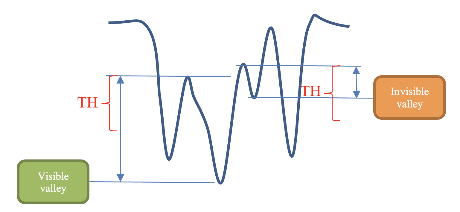
The separation between valleys and noise.
- Count the total number of distinguishable lines.
- The resolution (in lw/ph) is defined by the first place where only N–TH2 from N lines (distinguishable at the widest side) are distinguishable. In other words TH2 is the number of the merging lines which won’t fail the test (TH2 can be configurable).
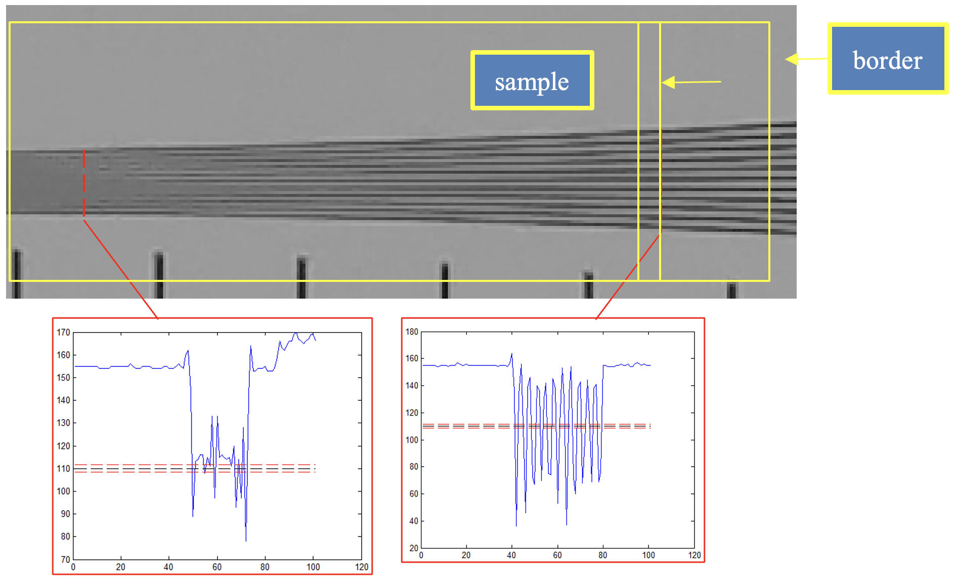
Resolution element. Selecting distinguishable lines. The plots below the image show the lines cross-section.
- All the threshold values should be estimated experimentally, based on a certain investigation of distinguish capabilities of the “average human observer” and might depend on brightness, chart geometry etc.
Calculation details
MTF is defined as the relative modulation of a sine pattern (a pattern of pure spatial frequency). To calculate MTF from the wedge, which is a bar pattern, it is treated as a square wave, which can be broken down to a fundamental frequency and harmonics by means of fourier transform analysis. (Only the fundamental is significant for MTF.) Here is the algorithm:
- Each selected region (ROI) is scanned line by line (where the scans are perpendicular to the wedge lines), and the outer limits of the wedge are detected. Interfering patterns (bars, calibration numbers, etc.) are ignored.
- The number of bars and the mean spacing between bars (and hence frequency, which is the inverse of spacing) of each line is detected. The spacing is a “noisy” number.
- The frequency for all lines is determined from a first-order polynomial fit of of the mean spacings or frequencies (depending on the type of wedge) for lines where the number of detected bars equals the total (i.e., at frequencies below the onset of aliasing).
- Modulation M is calculated for each scan line using equations based on Fourier transform analysis. If Y is the amplitude, x is distance across the scan, and f is the spatial frequency,
a = ∫Y(x) cos(2πxf) ; b = ∫Y(x) sin(2πxf) ; c = sqrt(a2 + b2) ; M = c / (2 mean(Y))
This is a sophisticated calculation that provides a more accurate estimate of MTF than the simple M = max(Y) – min(Y) calculation, which has a 4/π error derived from the Fourier coefficients of a square wave.
Special care is taken with the integration limits so that exactly N-1 complete cycles is used for N bars total. - MTF is derived from M, which may be taken from several wedges and normalized to 1 at low spatial frequencies. If a square ROI has been selected (which should have a single edge, i.e., low spatial frequencies), it is used to normalize MTF. If more than one wedge region is selected (two is frequent), the spatial frequency and MTF results are concatenated, sorted by frequency (merged in the overlap region), then smoothed to remove numerical artifacts.
Smoothing. MTF & Aliasing results consist of two curves: unsmoothed (thin dashed lines) and smoothed (thick solid lines). The smoothed curves are emphasized because the roughness in the unsmoothed curves is an artifact of the calculations, resulting from sampling phase and noise— irregularities can result from noise on a single scan line. The features of the unsmoothed curve have no physical meaning.