Analysis of Log Frequency-Contrast charts
| New in Imatest 4.0 Automatic region is available with the revised version of the chart, which includes registration marks in the corners. Sharpness and Texture Analysis using Log F‑Contrast from Imaging-Resource compares the the effects of sharpening and noise reduction in several cameras using images downloaded from Imaging-Resource.com. |

Revised Log F-Contrast chart: works with automatic region detection
Introduction
Log F-Contrast (short for Log Frequency-Contrast; not in Imatest Studio) measures the effects of signal processing— noise reduction and sharpening— on imaging system performance using a chart that varies in spatial frequency on the horizontal axis (log frequency increases with x) and in modulation ((max-min)/(max+min) signal, sometimes called Michelson contrast) on the vertical axis. Modulation is proportional to (y/h)2 for image height h. Because the Log F-Contrast chart is sinusoidal (rather than a bar pattern) its modulation is equivalent to SFR or MTF.
Log F-Contrast can be run through the Rescharts interface or as a fixed module (capable of analyzing batches of images).
| The Log F-Contrast chart is very similar to the Campbell-Robson CSF (Contrast Sensitivity Function) chart, which was first published in 1968. The (vertical) contrast variation is quite different for the two charts. |
This module is particularly valuable for measuring the loss of fine, low-contrast detail (texture) due to software noise reduction, which can result in a “plastic” appearance in areas where fine texture is missing. This type of nonuniform image processing, which is common in consumer cameras, especially those with tiny pixels (< 2 microns) such as camera phones, is often implemented as a bilateral filter, which can be simulated and analyzed in the Imatest Image Processing module. The chart can be purchased at the Imatest store or created by Test Charts and printed on a high quality inkjet printer. An image of a Log Frequency-Contrast chart, acquired with a Canon EOS-20D camera, is shown below, slightly reduced. The chart design was modified in July 2014 to work with automatic region detection in Imatest 4.0+.
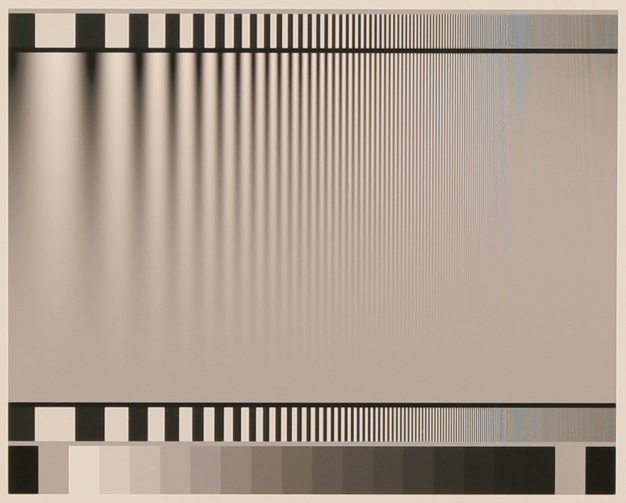
Log F-Contrast Image, Canon EOS-20D camera, 24-70mm f/2.8L lens set at 42mm, f/5.6, ISO 100
(pre-Imatest 4.0 version). Click on image to load full-size image.
| Modulation and Contrast The modulation ((maximum-minimum)/maximum+minimum) level of the sine pattern, represented linearly — also called Michelson contrast) varies from 1 at the top of the chart to 0 at the bottom. It does not vary linearly because the eye is highly nonlinear: if modulation were to decrease linearly the chart would have high visual contrast over most of its area. The dropoff in visual contrast is much more uniform when modulation is proportional to (y/h)2 for image height h. The contrast ratio is the maximum/minimum modulation. It would be infinity at the top of the chart (where modulation = 1), but it’s limited in practice by the printing process: it’s about 100:1 for semigloss (luster, etc.) charts and about 40:1 for matte charts. Contrast ratio drops off rapidly: in the middle of the chart, where modulation is 0.52 = 0.25, the contrast ratio is (0.5 + 0.25/2)/(0.5 – 0.25/2) = 0.625/0.375 = 1.667. It illustrates the eye’s extreme nonlinearity: the contrast ratio in the middle appears to be around half the ratio at the top of the chart, which is 25-60 times higher. |
Log F-Contrast divides the chart into twenty-five zones (numbered from top to bottom) for analyzing contrast (MTF), which can be displayed in several ways. Second-order interpolation and smoothing are used to increase the accuracy and readability of the MTF calculations. Spatial frequency is derived from the pattern.
Test charts window, showing the revised chart (works with auto region detection in Imatest 4.0+)
Creating and printing the chart
The Log Frequency-contrast can be purchased from the Imatest Store, downloaded, or printed on a high quality photographic printer from a file created with Imatest Test Charts.
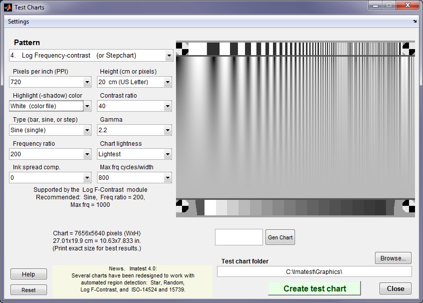
Test Charts has a number of options. The dialog box and recommended settings are shown on the right. The post-July 2014 chart design, which includes registration marks near the corners, is shown.
| Box | Recommended setting |
| Pattern | Log Frequency-contrast. |
| Pixels per inch (PPI) | Depends on printer. For best results set to 720 (Epson) or 600 (HP, Canon) and print at the indicated Height. |
| Height (cm) | Print height (refers to landscape orientation). To get the indicated PPI— for best print quality— the image should be printed at this height. |
| Highlight color | Usually White, but can be set at any of R, G, B, C, M, or Y. |
| Contrast ratio | Only affects the bar region; not important for this pattern. |
| Type (bar or sine) | Determines pattern type. Use sine for MTF measurements. Bar may be of interest to some users. Sine (single) is used for the examples on this page. |
| Gamma | Should be same as the gamma used for printing or the color space, e.g., 2.2 if you print using sRGB or Adobe RGB (1998). |
| Frequency ratio | The ratio between the lowest spatial frequencies (on the left) and the highest. 200 usually works well. |
| Chart lightness | Only affects bar region; not important. |
| Ink spread comp. | Best left at 0. |
| Max. frq cycles/width | This number refers to m = the maximum cycles/width of the printed chart. 1000 is a good choice in most cases. If a photographic image of the chart occupies a fraction f of the image pixel width W, the maximum spatial frequency (in cycles/pixel) of the chart image is mimage = m/fW. For example, if a chart occupies f = 0.3 of the image width W of 3000 pixels, mimage = 1.11 cycles/pixel. Should be set for a maximum image spatial frequency of at least 0.7 cycles/pixel (1.4x Nyquist frequency). 1 cycle/pixel is a good number to aim for, leaving a little margin. See text below. |
Example: The Log Frequency-contrast chart shown on the right occupies 857 of 3504 horizontal pixels of an original image taken with the Canon EOS-20D. f = 857/3504 = 0.2446. The chart was created with m = 1000 cycles/pixels. The maximum spatial frequency in the chart image is mimage = m/fW = 1.17 cycles/pixel— slightly higher than optimum, but not excessive because the highest frequencies occupy relatively little chart real estate. The chart image spatial frequencies are detected automatically.
When the settings are correct, select the TIFF output file name using the Test chart directory and File name boxes on the lower-right and click . Do not print from the preview image. Print the image from the TIFF output file from an image editor or viewer, paying careful attention to the printed image size and color management settings. More details can be found on Test Charts. Examine the printed chart carefully for defects and for image quality, especially at high spatial frequencies. The tones in the 16-step grayscale step chart at the bottom of the test chart should be compared with a standard chart such as the Kodak Q-13/Q-14 with density steps of 0.1. (There may be some divergence in the darkest zones, but zones 1–12 should be very close.) The sine pattern tones will be accurate if the tones match visually.
Photographing the chart and running the program
Mount the chart on a flat dark board— 1/2 inch foam board works well; thinner board warps more easily. Depending on the number of horizontal pixels in the chart to be analyzed, the chart should occupy 1/3 to 1/4 of the horizontal frame. Other charts can be mounted along with it.
Orientation. Although the orientation shown on this page is recommended, the pattern may be rotated by multiples of 90 degrees: it can have portrait as well as landscape orientation.
Photograph the chart using the sort of lighting described in Imatest Lab or How to test lenses, taking care to avoid glare. Save the image in any one of several high quality formats, but beware of JPEGs with high compression (low quality), which will show degraded quality, unless, of course, you are testing JPEG degradations. (Unlike the slanted-edge, the Log f-Contrast pattern reveals JPEG losses quite clearly). RAW images decoded with dcraw tend to produce very different results from in-camera JPEGs.
For Rescharts (interactive) analysis: Open Imatest, then click on . Select a pattern to analyze (in this case, Log F-contrast) by clicking an entry in the popup menu near Chart type or by clicking on if Log F-contrast is displayed. The button and popup menu (shown on the right) are highlighted (yellow background) when Rescharts starts. Select the image file to read.
For fixed (non-interactive; batch capable) analysis: Open Imatest, then click on the Log F-Contrast button in the Imatest main window. Select the file or batch of files to analyze.
If the pixel size is the same as the previous Log F-contrast run, you’ll be asked if you want to use the previous ROI, adjust the previous ROI, or crop anew.
Cropping The pattern should be cropped to leave a small margin (about 1/2 – 1% of the image height) at the top and bottom of the pattern, as shown below. The fine adjustment window may be maximized to facilitate fine selection.
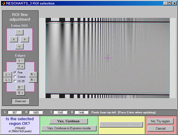
Crop for the Log Frequency-contrast chart. Leave a small margin
(1/2 – 1% of the image height) at the top and bottom.

If (not Express mode) is selected, the settings window shown on the right appears.
Gamma is used to linearize the test chart. It can be measured by Stepchart or Multicharts using the 16-step (0.1 density increment) grayscale below the Log F-C pattern. 0.5 is a typical value for color spaces intended for display at gamma = 2 2 (sRGB, Adobe RGB, etc.).
Channel is R, G, B, or Y (luminance; the default).
MTF plots selects the x-axis scaling. If Cycles/inch or Cycles/mm are selected, the pixel spacing (um/pixel, pixels/inch, or pixels/mm) should be entered.
X-axis scaling for linear plots selects the maximum spatial frequency to be displayed.
Plot (not for Rescharts) The five plots in this section are available as output figures. They are referenced as Plot n in fixed module below. EXIF data appears on the right of plots 1, 2, 3, and 5.
Don’t worry about getting all settings correct: You can always open this dialog box by clicking on in the Rescharts window.
After you press , calculations are performed and the most recently-selected display appears.
Output
The Display box in the Rescharts window, shown below, allows you to select any of several displays. Display options are set in boxes that appear below Display. All displays except Exif data have a channel selection option (Red, Green, Blue, or Luminance (Y) (0.3R + 0.59G + 0.11B).
| Display | Description |
| Pattern (original and linearized) Plot 1 in fixed module |
Show pattern: normalized pixel levels (max modulation) on top; linearized (max modulation and selected row) on bottom |
| MTF (Linear frequency scale) Plot 2 in fixed module |
Display MTF for several contrast levels (rows 1-22 in steps of 3, where the chart is divided into 25 rows for analysis) with a linear frequency scale. |
| MTF (log frequency scale) Plot 3 in fixed module |
Display MTF for several contrast levels (rows 1-22 in steps of 3) with a log frequency scale. A thumbnail of the pattern is also displayed on the same scale. |
| MTF/contrast (2D pseudocolor contour) Plot 4 in fixed module |
Only affects the bar region; not important for this pattern. |
| MTFnn (frequency where MTF = nn%) Plot 5 in fixed module |
Displays MTFnn or MTFnnP (frequencies where MTF = nn% of low frequency values or peak, respectively). Displayed in selected frequency units (cycles/pixel, LW/PH, etc.) or normalized |
| EXIF data | Show EXIF data if available. |
|
|
| Saves an image of the Starchart window as a PNG file. If you check Display screen in the Save screen dialog box, the image will be opened in the editor/viewer of your choice. (Irfanview works well, and it’s free.) | |
| Saves detailed results in a CSV file that can be opened by Excel and also in an XML file. | |
Pattern (original and linearized)

Pattern: original and linearized. Similar to Plot 1 in fixed module
The entire Rescharts window is shown. The upper plot is the normalized pixel level (pixel level/255 for bit depth of 8) of the top of the image (row 1 of 25; where modulation is maximum). The lower plot (linearized using the gamma setting) allows the row to be selected: The cyan plot is the top of the chart (the highest modulation). Note that row 10, which is displayed in black, has much less sharpening (much less of a peak around 0.2 cycles/pixel) than maximum modulation row 1.
MTF


MTF/contrast (2D pseudocolor contour)
This selection produces the most detailed results. It has several options:
Parameter determines which parameter to display. Normalized contrast level is the most generally useful choice.
| Parameter | Description | |
| Modulation (unnormalized) |
Displays MTF, which decreases with chart modulation (vertical position in the 2D pseudocolor display). The chart is divided into 25 rows for analysis.MTF at low spatial frequencies is equal to chart modulation. |  |
|
MTF (normalized – most useful display) |
Displays MTF normalized to 1 at low spatial frequencies for all chart contrast levels.This is the most generally useful display because it clearly shows how response changes with contrast level. In a camera with uniform signal processing (i.e., the same sharpening and noise reduction throughout the image, regardless of the presence of edges), the contour lines would be vertical. Most cameras have some sharpening (high frequency boost) in the presence of contrasty edges and noise reduction (high frequency attenuation) in their absence. This is evident in the display on the right (explained in more detail below). The table below contains the relationship between the modulation and chart contrast scales. See Log F-Contrast from Imaging Resource for numerous examples. |
 Plot 4 in the fixed module Plot 4 in the fixed module |
| Normalized contrast loss | Displays MTF normalized to 1
Results can be difficult to interpret, especially in the presence of noise. |
 |
Style selects the frequency scale and whether to show a color bar to the right of the main display.
| Style | Description |
| Log frequency | The horizontal axis displays frequency on a logarithmic scale. The maximum display frequency can be set by pressing . |
| Log frequency, color bar | The horizontal axis displays frequency on a logarithmic scale. The maximum display frequency can be set by pressing . A color bar showing the color scale is displayed to the right of the main plot. |
| Linear frequency | The horizontal axis displays frequency on a linear scale. |
| Linear frequency, color bar | The horizontal axis displays frequency on a linear scale. A color bar showing the color scale is displayed to the right of the main plot. |
|
Three contrast definitions are used in imaging literature. It’s important to know which one is used. Weber contrast: \(C_{Weber} = \frac{L_{max}-L_{min}}{L_{min}} = \frac{L_{max}}{L_{min}}-1\) Simple contrast: \(C_{Simple} = \frac{L_{max}}{L_{min}}\) Used for the chart contrast scale on the right of the MTF contour plots. Michelson contrast (modulation): \(Modulation = \frac{L_{max}-L_{min}}{L_{max}+L_{min}} \) Example: CSimple = 2 (2:1) corresponds to CWeber = 1 (100%) or Modulation = 0.333. |
The displays on the right show the Normalized contrast level (MTF normalized to 1 at low spatial frequencies for all chart modulation levels) for the Panasonic TZ1 camera with ISO speed set at 80 (right) and 800 (right, below). Spatial frequency is displayed on a linear scale with a maximum frequency of 0.5 cycles/pixel = 1920 LW/PH (the Nyquist frequency; selectable by pressing ).The image on the right (ISO 80) shows significant sharpening at moderate to high modulation levels: peak normalized modulation is over 1.1 for chart modulation (shown in the scale on the left) greater than 0.18 (about 1.3:1 contrast ratio; shown inside the image, just to the left of the row number). The amount of sharpening decreases very gradually with chart modulation, indicated by the moderately slanted contour lines between 0.9 and 0.1 at modulations over 0.2.
Plot 4 in fixed module
 Normalized contrast: Panasonic TZ1, ISO 80
The difference between the two images is striking. At ISO 800 the TZ1 has much less sharpening and more noise reduction— and correspondingly less detail. The amount of sharpening decreases more rapidly with contrast than for the ISO 80 case, as shown by the more slanted contour lines.
 Normalized contrast: Panasonic TZ1, ISO 800
MTFnn (frequencies where MTF = nn% of low frequency or peak values)
This selection produces a concise summary of results for this module. It has several options:
| Parameter | Description |
| MTFnn | The spatial frequency where MTF drops to nn% of its low frequency value. Curves are plotted for nn = 70, 50, 30, 20, and 10 (%). MTF50 is the most frequently used result; it corresponds to bandwidth in electrical engineering. The horizontal axis is the original chart contrast (analyzed in 24 rows). The vertical axis is the MTF frequency. Its scale (cycles/pixel, cycles/mm, cycles/in, or LW/PH) can be set by pressing . |
| MTFnnP | The spatial frequency where MTF drops to nn% of its maximum (peak) value. Identical to MTFnn for unsharpened or moderately sharpened images, but it can be lower for strongly sharpened images, which have a distinct response peak. It has a slightly better correlation to perceived sharpness than MTFnn. Horizontal and vertical axes are identical to MTFnn. |
| MTFnn NORMALIZED | The spatial frequency where MTF drops to nn% of its low frequency value, normalized to 1 at low spatial frequencies. This allows the percentage change of MTFnn with chart contrast (horizontal axis) to be conveniently compared. |
| MTFnnP NORMALIZED | The spatial frequency where MTF drops to nn% of its maximum (peak) value, normalized to 1 at low spatial frequencies. This allows the percentage change of MTFnn with chart contrast (horizontal axis) to be conveniently compared. |
| The plots on the right show MTF70 through MTF10 in units of Cycles/Pixel for the Panasonic TZ1 camera with ISO speed set at 80 (right) and 800 (right, below). They are derived from the same images as the Normalized contrast level plots, above.The MTFnn units (Cycles/pixel to Cycles/mm, Cycles/in, or LW/PH) can be selected using the button. |
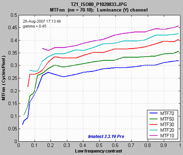 MTF70-MTF10: Panasonic TZ1, ISO 80 MTF70-MTF10: Panasonic TZ1, ISO 80 |
| At ISO 800 the TZ1 has much lower MTFnn for all values of nn from 70 through 10. Note that the vertical scales are different: 0.5 (above; ISO 80) vs. 0.35 (right; ISO 800).It also falls off much more rapidly with contrast; evidence of stronger noise reduction, i.e., nonlinear signal processing.The MTFnn display shows the changes in performance between different settings (ISO 80 and 800 in this case) more clearly than the 2D pseudocolor contour plots, above, even though (or perhaps because) it contains less detail. |
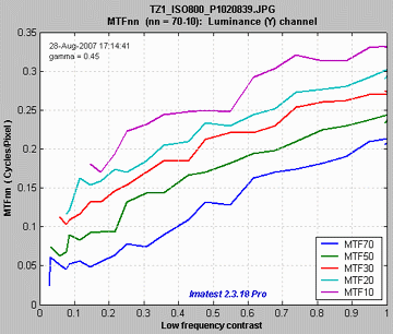 MTF70-MTF10: Panasonic TZ1, ISO 800 MTF70-MTF10: Panasonic TZ1, ISO 800 |
Calculation details
Second-order interpolation, illustrated below, is used in detecting peaks at spatial frequencies between 0.06 and 0.5 cycles/pixel It increases the peak amplitude for detected peaks between sampling points.. At lower frequencies it does little to improve accuracy because the signal varies slowly. It also has no benefit above the Nyquist frequency (0,5 cycles/pixel), where the signal consists of noise and aliasing. The red dots in the illustration show the peak amplitudes corrected with second order interpolation (with uncorrected peak locations).
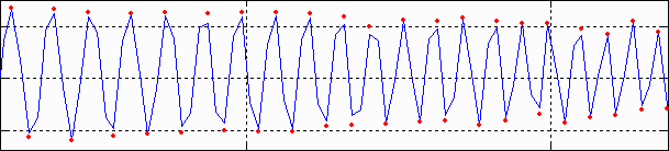
The peak and its two adjacent points are assumed to fit the equation, y = ax2 + bx + c. The actual peak location is xp = –b/2a (x2 is shown in the above plot). The peak amplitude is ap = b2/2a + c.
Smoothing The MTF & Moiré displays contain two curves: unsmoothed (thin dashed lines) and smoothed (thick solid lines). The smoothed curves are emphasized because the roughness in the unsmoothed curves is entirely an artifact of the calculations, resulting from sampling phase and noise— irregularities can result from noise on a single peak. Irregularities are reduced, but not eliminated, by second-order interpolation. It is important to realize that the features of the unsmoothed curve have no physical meaning.
Frequency display Let x1 and x2 be the left and right x-axis limits and let f1 and f2 be the minimum and maximum display frequencies. Then,
Display frequency = \(\displaystyle f = f_1 10^{k(x-x_1) / (x_2-x_1)}\) where \(\displaystyle k = log_{10}(f_2/f_1)\)
Frequencies are detected automatically in Log F-Contrast. The frequency ratio (f2 / f1) is specified when creating the chart in Test Charts.